An Overview
Some websites are stuck in an era where good design was thought of as far from essential. Basic functionality used to be the bare minimum when it came to user interfaces, and fortunately we have since discovered the essential nature of good design and its role to completely transform a product.
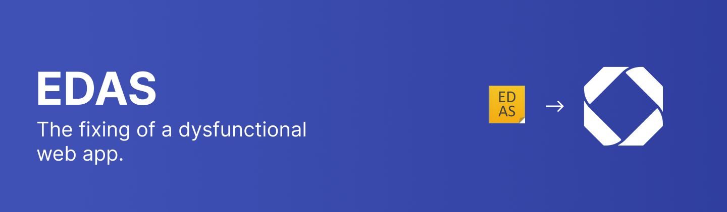
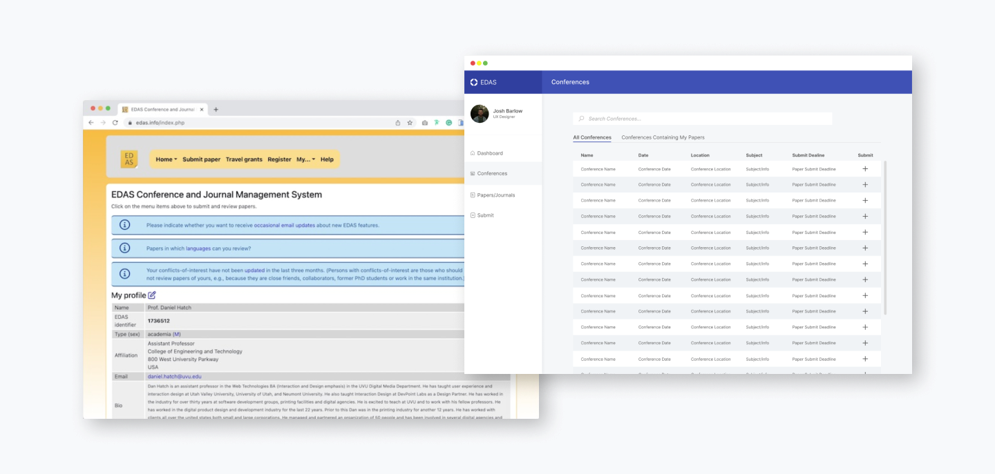
This is unfortunately not the case of EDAS, the academic conference and journal submission web app system. Unorganized excel sheets and non sensible design seen to be center of this web app, and this project aims to eliminate these elements and transform the web app into modernity.
The Goal
Not only did the visual design and aesthetic of EDAS lack severely, the basic functionality of sensible navigation was simply not there. The goal of this re-design is to aesthetically transform the web app into a more modern looking design, while also restructuring the app into an interface that makes much more semantic sense to any potential user.
Planning it Out
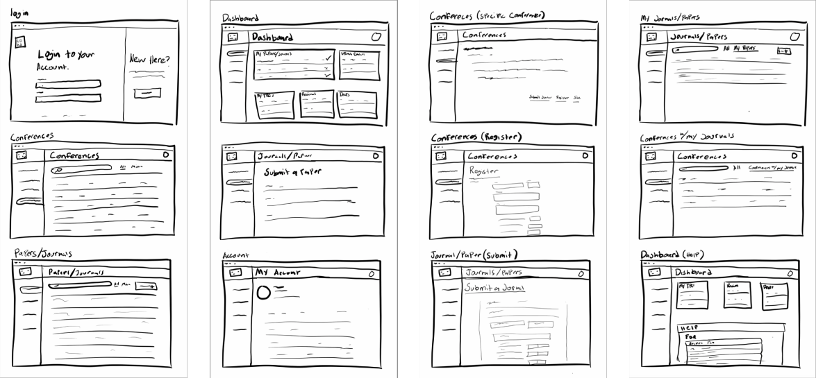
The process began first with assessing the many elements of the original web app design and identifying the ways in which they fall short. The main areas that required the most restructuring were the navigation elements as well as the general layout. After identifying various problem areas, I first began to develop rough sketches for what a re-design addressing those problem areas would look like.
Developing Structure
After information is gathered sketched out for what specifically needs to be done to overhaul the app, structure then then begin to form in the wire-framing process. Here, decisions like spacing, layout and basic typography and iconography are made.
In the original design there is no real functional home page. I decided to consolidate all the the “My” nav elements that lead to separate disjointed pages that easily could have been grouped together. One big update was gathering these separate pages and synthesizing them into one readily accessible Dashboard/Home page.
Finishing Touches
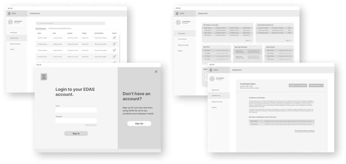
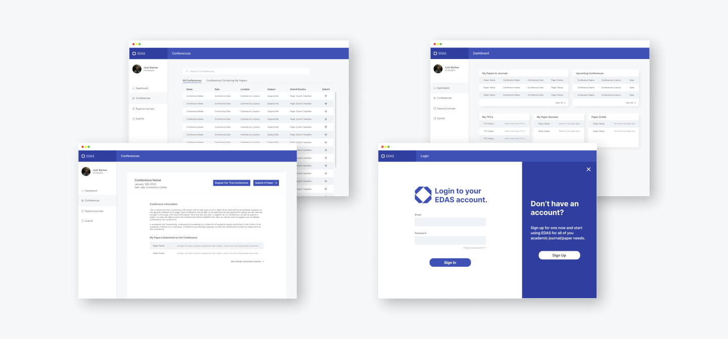
After basic structure has taken form, more in-depth design decisions like color, functionality, and finalizing typography and iconography take place in the surface comp phase. Here I also made general styling decisions that lead to somewhat of a complete brand overhaul including an updated logo.
Outcomes & Results
As one can easily tell by the state of the web app before the re-design, the main outcomes and results from this project are that the functionality of the product has increased and its design has been properly refreshed to be much more modern and clean. Many navigation elements including all drop down sub-nav elements have been done away with in place of an extremely simplistic side nav.
While this specific design wasn’t actually implemented to transform the current EDAS site and was merely limited to a school project, other essential outcomes and results can be found in my personal development as a designer and my ability to implement to real world designs and fix real problems.
*Note Joshua Barlow is a student in the Digital Media program at Utah Valley University, Orem Utah, studying Interaction Design. The following article relates to the "re-design of a web app" project in the DGM 1240 Course and is representative of the skills learned.